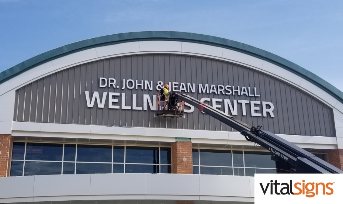
Guide to sign placement

As the old real estate mantra goes, it’s all about location, location, location. The same goes for your signage. Where you place your signage is critical to ensuring it’s most visible and eye-catching. Whether it’s indoor or outdoor, consider the positioning of your sign in the sign design and installation process. Here are tips for placing your signage:
Indoor vs. Outdoor
First, you need to determine whether your sign will serve most effectively indoors or outdoors. It is largely based on your sign’s content and your goals and preferences. Outdoor signs usually work best to advertise using your logo and short phrases while indoor signage can be more informative and often act to design the inside of your facility.
If you’re looking to increase brand awareness and attract potential customers with your logo and taglines, outside signage is your best bet. However, if you are concerned about your store aesthetics and/or want to inform guests or employees of policy or wayfinding, indoor is your place. Of course, you can really optimize by using signage both inside and outside.
Legibility distance
Start by choosing one or multiple points of view at which you would like your sign to be visible. Utilize vantage points that are high traffic with high visibility by the most people, like near the front door. Depending on the size of your sign, place it so that it is legible. A person with 20/20 vision can see with decent clarity up to 20-23 feet ahead of them. Do with that information what you will.
Viewing height
The height at which you place your sign is another key determinant of visibility. It can not be too high that it goes right over passerbys’ heads, literally, and not too low that it can’t attract guests who are at a distance. Sign design and installation experts can further advise you on the best heights to place your sign so that it is seen by the most potential visitors.
Surroundings and distractions
You should avoid placing your sign in busy surroundings with a lot of potential distractions. Place your sign in a clean, open space with little clutter so that it is visible to guests from all vantage points. Nearby items blocking the view of your signage could be what keeps a potential customer from visiting or, in the case of indoor signage, what prevents them from behaving according to policies.
Visit us
In the sign design and installation process, be mindful of your sign’s placement. Ensuring your sign is in the right place at the right height, distance and that surrounding objects are not blocking it is crucial to effective signage. We at VitalSigns want to help. Get in touch with us for your signage projects!

